Checkout is the least forgiving page you own. By the time someone gets there, they have already decided to buy, so every bit of friction hits harder than it would anywhere else in the funnel. A third of a second of extra latency, or one error message that does not say what went wrong, flips a sale into an abandon at rates you simply do not see earlier on.
What is the single largest checkout-page CVR lever?
Guest checkout. The Baymard Institute measured first-time-buyer completion across 31 verticals, with and without guest checkout available, and the gap is large enough that it sits at the top of the list (Baymard Institute, 2026).
The reason is that it removes friction at the highest-anxiety moment. The visitor has already mentally clicked Place Order. They do not want to choose a password, read a privacy policy, or try to remember whether they already have an account.
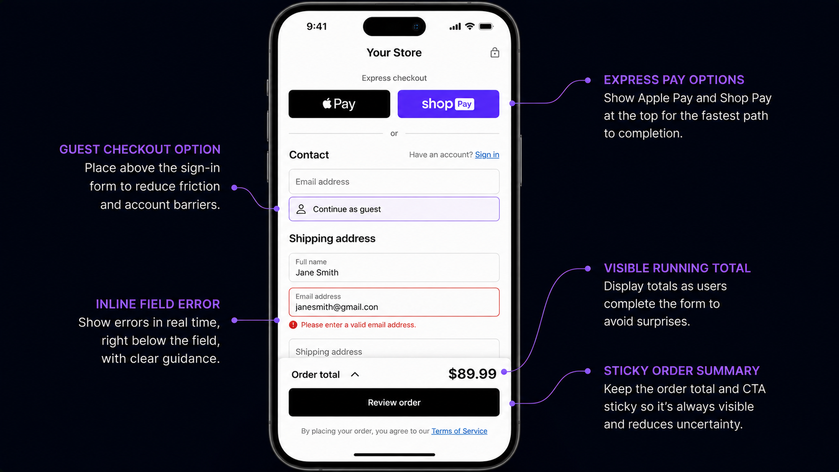
Three rules make it work. Default to guest, and offer the account as an opt-in: the visitor types their email, and below it sits a "Save my details for next time" checkbox, off by default. Do not ask for a password during checkout; offer passwordless account creation by magic link after the purchase so the option survives without forcing a decision now. And put guest checkout above the sign-in form: the 2018 pattern asked you to sign in first, the 2026 pattern leads with guest and tucks "have an account?" below.
One measurement note: returning customers convert about the same whether they use guest or account flow, because they already cleared the friction. Most stores blend new and returning into one CVR and underestimate the gap. Segment by new versus returning before you benchmark.
How does Apple Pay / Google Pay / Shop Pay change the math?
The lift is biggest on apparel and beauty, where mobile share is high, and smallest on B2B.
The mechanism is simple: it deletes the credit-card form. The wallet authenticates with biometrics, the address auto-fills, and the visitor reaches order confirmation in 8-12 seconds.
For Shopify stores, Shop Pay integration is about two clicks of admin work and delivers the single largest mobile-checkout lift the platform offers.
How should errors be handled at checkout?
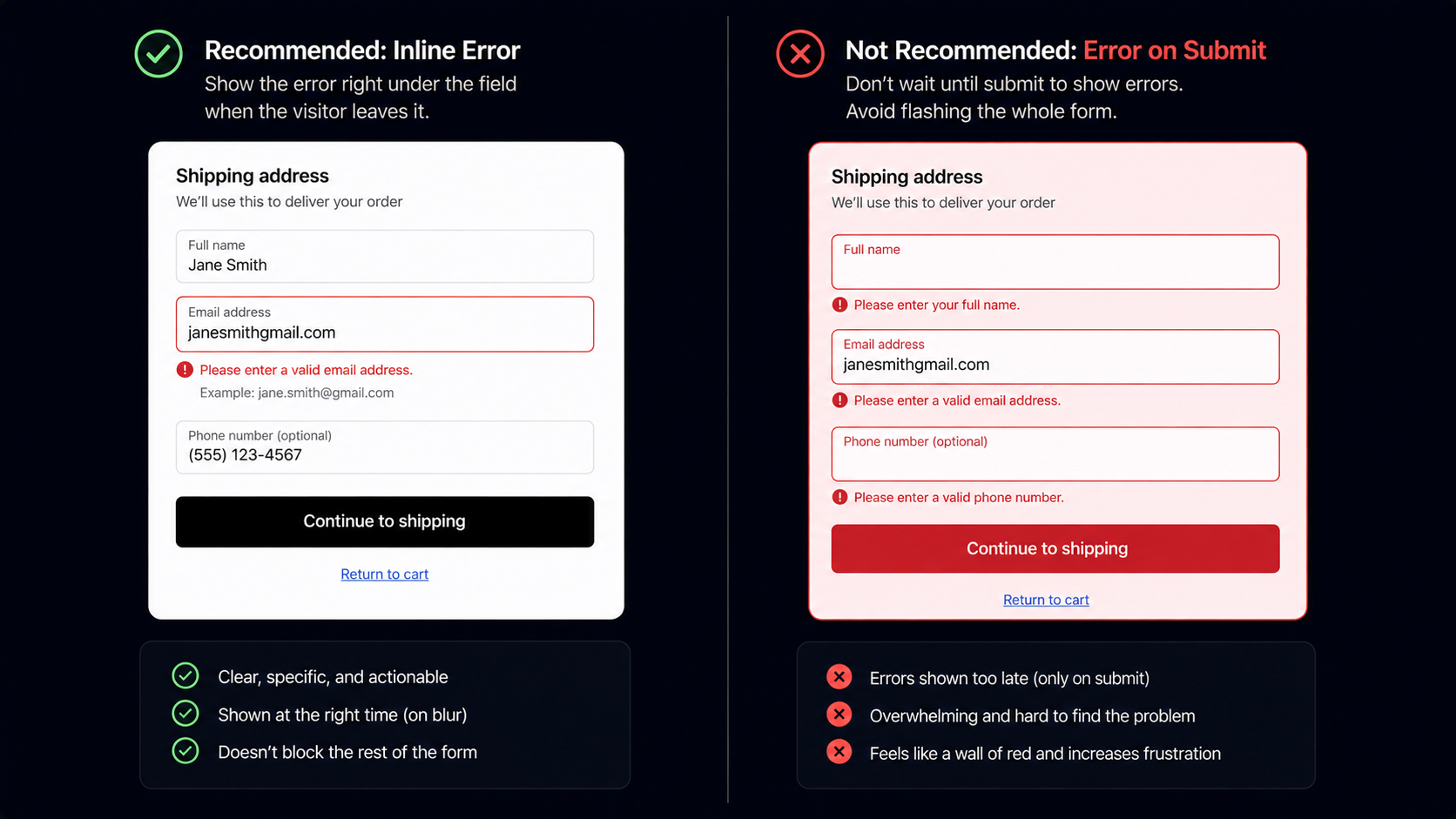
Inline, on-blur, and polite. The Baymard panel attributes 8-12% of checkout abandonment to error-handling problems alone (Baymard Institute, 2026). The usual mistakes cluster together: validating on submit instead of on field-blur, so the visitor fills the whole form, hits Place Order, and gets six errors at once; red-flashing the entire form, which reads as failure rather than feedback (nobody enjoys a form that yells at them in red); vague messages like "Invalid input" that tell the visitor nothing; and messages that disappear before the visitor has finished reading them.
The pattern that works: the visitor types, leaves the field, validation runs, an inline error appears under that field if needed, the visitor corrects it, and the error clears the moment the field is valid. Errors are friction. The goal is to remove them, not to dramatize them.
How should the order summary work on mobile?
Keep a sticky one-line summary at the top of the viewport showing the total and item count, and let it expand on tap to reveal the full line items. Visitors do not need every line item in view at all times; they need the total and the count, with the detail one tap away.
How do I handle tax and shipping transparency?
The Baymard panel ranks unexpected costs at checkout as the number-one cited reason for abandonment, at 48% (Baymard Institute, 2026). The fix is not to lower the costs, it is to surface them earlier so the visitor's expectation matches the checkout total. Three things work: show shipping on the cart page before checkout (a calculated estimate from a stored ZIP, or "free over $X"); surface the tax estimate on the cart page too; and keep the running total prominent at checkout, updating visibly with every change.
Which checkout levers matter most?
The 5-25% range in the title spans two starting points: a store with a clean checkout will see the low end, and one with several of the classic problems will see the high end. Rough priority order: get express wallet buttons in first, since they are the biggest mobile lever and the fastest to ship; then guest checkout; then cost transparency on the cart; then inline error handling; then the persistent mobile order summary. The smaller, reliable levers, trust badges and address autofill, come after.
Single-page or multi-step checkout?
The 2018 advice was single-page, the 2024 backlash swung to multi-step, and the honest 2026 answer is that it depends on the vertical, so test it. The real question is not single versus multi in the abstract; it is how long your form is and how high your AOV is. Short form and low AOV point to a single page. Long form and high AOV point to multi-step with a clear progress indicator.
What this means for an operator in 2026
Add the express-checkout buttons now, not next quarter. Apple Pay, Google Pay, and Shop Pay are the largest mobile lever in 2026, and the work is about a day on Shopify or two on a Stripe-backed custom cart.
The short version: checkout is friction removal, not persuasion engineering. The lift comes from a shorter path and easier inputs, not from convincing the visitor to buy. They already decided. The only question is whether the page lets them finish.
Further reading
- GuideThe cart-abandonment recovery frameworkThe cart-stage levers that pair with checkout fixes.
- GuideProactive chat in 2026Cart-stage and checkout-stage signal patterns.
- BlogMobile vs desktop conversion rate 2026Why express checkout is the largest mobile lever.
- BlogEcommerce funnel analysisWhere checkout fits in the full drop-off picture.
- ToolCart abandonment calculatorModel checkout-stage recovery on your traffic.
Frequently asked questions
Vertical-dependent. Apparel, beauty, and food lean single-page; electronics, home, and B2B lean multi-step with progress. Test it; do not assume.
Last updated June 10, 2026.