Old proactive chat fired on a timer and hoped for the best. The better version waits until a visitor actually stalls, then steps in at the point where they are stuck. That shift leans on three findings from behavioral economics that have been sitting in the conversion literature for decades, and the shape of the help you offer matters just as much as when you offer it.
What is loss aversion and how does it apply to cart abandonment?
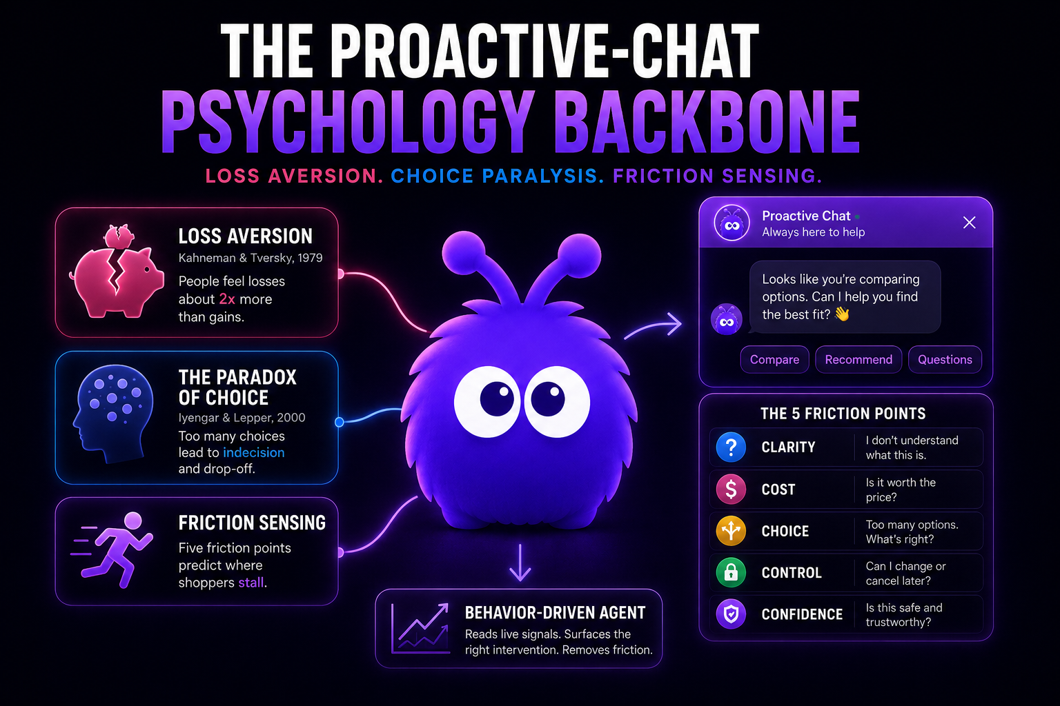
Daniel Kahneman and Amos Tversky's 1979 prospect-theory paper introduced loss aversion: losses feel roughly twice as painful as equivalent gains. The finding is one of the most replicated in behavioral economics; the magnitude varies but the direction does not.
On a cart page, the finding bites in a specific way. A visitor who has added an item to the cart has mentally taken ownership of it. The cart is no longer a list of "things I might buy"; it is a list of "things I have, contingent on checkout". An exit at that point is a loss, not a non-purchase.
The intervention design follows from the framing. A discount on the cart reframes the exit as a foregone gain ("you could save $5"). A free-shipping nudge at a specific threshold reframes the exit as an avoidable loss ("$8 short of free shipping").
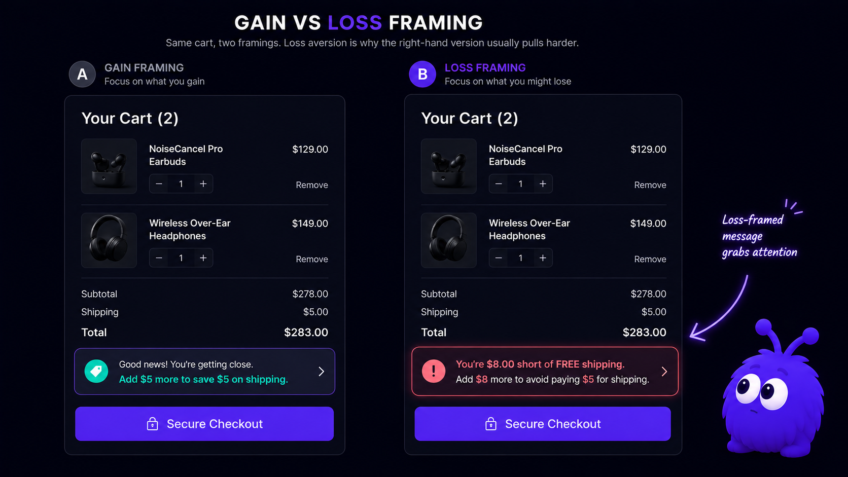
The same logic applies to back-in-stock alerts, low-inventory cues ("3 left at this price"), and time-bound offers. Each reframes the exit as a loss. The framing is consistent with the cart abandonment guide recommendations and the behavioral intervention glossary entry.
How does the paradox of choice apply to product pages?
Sheena Iyengar and Mark Lepper's 2000 jam study is the canonical demonstration. Shoppers at a Menlo Park supermarket were shown either 6 jams or 24. The 24-jam display attracted more visitors but produced 10x lower purchase rate (Iyengar and Lepper, 2000). The finding generalizes: more choice attracts attention but reduces decision rate.
On a product page or category grid, the same pattern repeats. A 48-item grid increases dwell time and decreases conversion versus a 12-item curated set. The visitor is not lazy; the visitor is doing comparison work that is computationally expensive without an organizing constraint.
A proactive agent can surface the organizing constraint. The intervention is not "buy this one"; it is a narrowing question — skin type, room size, use case, intended user, budget band. The question collapses the choice space from N to two or three. The two-or-three choice is the one the visitor was about to give up trying to make.
Dwell time alone will not tell you which is which. Lingering on a product page usually means focus. Lingering on a category page often means paralysis. To tell them apart you need a richer read of behavior: an intent signal that looks at how someone scrolls, whether they keep clicking back, and how often they hover without clicking. Repeated grid-scrolling without a click for 40+ seconds is the choice-paralysis signature.
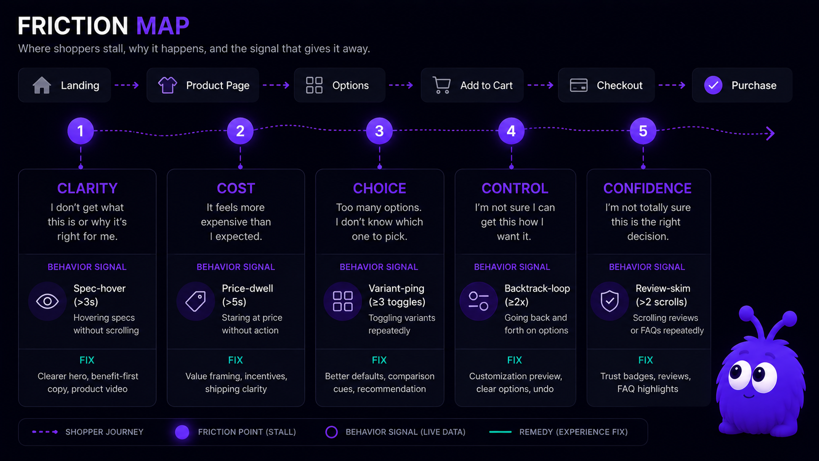
What are the five friction points proactive chat addresses?
The friction-point framework is older than the 2026 chat literature; CRO practitioners have used variants of it since the late 2000s. The five-point version that maps cleanly onto behavior signals:
| Friction point | Visitor question | Live signal | Intervention shape |
|---|---|---|---|
| Clarity | What is this product, exactly? | Hover on spec table, dwell on description, FAQ-tab open without scroll | Plain-language summary, comparison to a known reference |
| Cost | Is this price fair? | Dwell on price element, scroll to reviews and back, currency-conversion behavior | Bundle, free-shipping threshold, payment-plan surface |
| Choice | How do I narrow these options? | Repeated grid-scroll without click, multiple comparison-tab opens | Narrowing question (use case, size, budget) |
| Control | What happens if I keep going? | Form-field abandonment, hover on Add to Cart without click, checkout-step backtrack | Step preview, no-credit-card-required reassurance |
| Confidence | Can I trust this brand and product? | Reviews-tab dwell, About-page navigation, return-visit pattern | Trust marker, return-policy surface, social proof |
The framework is not a formula; the same friction point sometimes shows up across multiple signals, and a single signal sometimes encodes more than one friction. The point is the mapping — the 2018-era proactive chat fired one generic message at every stalled visitor; the 2026 version reads the signal and ships the intervention shape that matches the friction.
How does an agent match the signal to the friction?
A behavior-driven agent watches the ordinary signals of a visit — how someone scrolls, where they pause, what they hover over, whether they have a cart going, whether they have been here before — and uses that to guess which friction point is live. Once it has a guess, it picks a response built for that friction and grounds it in your own site content so the reply talks about the real product or page in front of the visitor.
A few examples make the mapping concrete.
Hover on a spec table, then a clarity nudge. When the cursor lingers on a spec, the agent offers a plain-language summary of what that spec means, sometimes with a familiar comparison ("about the size of an A4 sheet"). It is not asking for the sale. It is removing a comprehension barrier.
Dwell on the price and a trip to the reviews, then a cost nudge. A shopper checking the price against the reviews is reassuring themselves. The agent can surface a bundle, a free-shipping threshold, or a payment-plan link. That answers the question the visitor is actually asking instead of brushing it aside.
Scrolling a category grid without clicking, then a choice nudge. Here the agent offers a narrowing question matched to the category: skin type for skincare, room size for furniture, seat count for software. That narrowing question is the proactive chat pattern that fits the paradox-of-choice signature.
Most store owners never touch this mapping directly. You pick the outcome you care about, recovering hesitant carts or qualifying pricing-page visitors, and the agent works out which response fits which signal.
When does the behavioral-economics framing backfire?
Loss aversion can be over-pulled. A site that uses scarcity language on every product page trains visitors to ignore it; the Baymard Institute 2026 cart-abandonment review noted that scarcity overuse correlates with elevated bounce rates on returning visitors. The intervention works once per session, not three times.
The paradox-of-choice intervention can also backfire. If the narrowing question is too narrow — forcing a choice the visitor is not ready to make — it reads as a survey, not help, and nobody came to buy a sofa and stayed for a questionnaire. Two options can feel forced; three tends to feel like guidance.
The deeper failure mode is treating behavioral economics as a manipulation toolkit rather than a sensing toolkit. The honest framing: the agent reads where the visitor is stuck and removes the obstacle. If the agent reads the signal correctly but the intervention is mistimed (fires too early), aggressive (asks for the sale before the friction is resolved), or generic (does not reference the visitor's actual page), the framework's predictive value is wasted.
What this means for buyers picking a chat tool
If you are evaluating a proactive-chat product, three things are worth pressing on:
- Ask which behavioral-economics findings the intervention library is built on. "Behavior-driven" with nothing behind it is a marketing line. A real implementation will name loss aversion, choice paralysis, or a friction-point taxonomy without flinching.
- Inspect the intervention library, not just the trigger logic. A vendor with five generic templates and great triggers is worse off than one with thirty friction-mapped templates and decent triggers. The intervention is the part the visitor actually sees.
- Insist that the mapping is editable. No two stores have the same friction profile. Treat the vendor's defaults as a starting point, and check that an operator can repoint a signal to a different intervention without filing an engineering ticket.
Behavior signals tell you where someone is stuck. Behavioral economics tells you what kind of help moves them forward. A good proactive-chat tool needs both layers, and you should be able to see and edit each one.
Further reading
- GuideProactive chat in 2026The full implementation guide for the trigger and intervention stack.
- GuideHow onsite conversion agents workThe category that uses behavioral-economics framing as a backbone.
- BlogBehavior-triggered chat vs time-on-page chatHow signal quality compounds intervention quality.
- ToolCart abandonment calculatorModel the loss-framed-intervention upside on your traffic.
Frequently asked questions
Loss aversion (Kahneman and Tversky, 1979), the paradox of choice (Iyengar and Lepper, 2000), and a five-friction-point framework that maps each stall to a live behavior signal.
Last updated June 10, 2026.