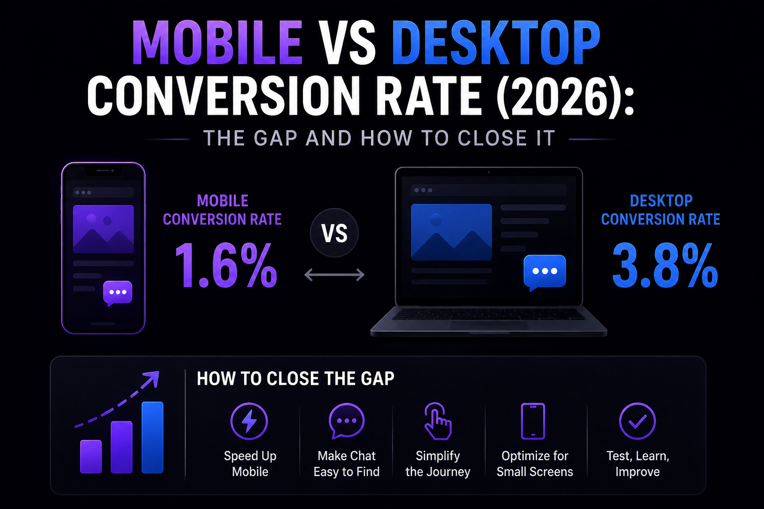
Mobile passed 50% of ecommerce visits back in 2017. By 2026 it accounts for 73% of visits but only 58% of revenue (Baymard Institute, 2026). That distance between traffic share and revenue share is the conversion-rate gap, and it is one of the most stubborn problems in ecommerce.
What is the mobile vs desktop conversion rate gap in 2026?
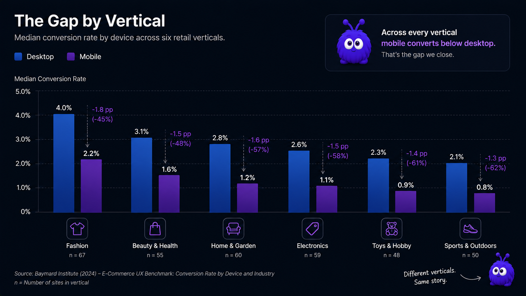
The Baymard Institute 2026 panel (10,000+ tracked sessions across 31 ecommerce verticals) reports median ecommerce CVR by device:
| Vertical | Mobile CVR (median) | Desktop CVR (median) | Mobile/desktop ratio |
|---|---|---|---|
| Apparel and accessories | 1.9% | 3.1% | 0.61x |
| Beauty and skincare | 2.2% | 3.4% | 0.65x |
| Home and furniture | 1.4% | 2.9% | 0.48x |
| Electronics | 1.6% | 2.8% | 0.57x |
| Food and grocery | 2.0% | 2.6% | 0.77x |
| Pet supplies | 2.1% | 3.2% | 0.66x |
The 2026 median ratio is 0.59x, slightly improved from 0.51x in 2022 (Baymard Institute, 2022 vs 2026). The gap survives every cohort split — time of day, traffic source, returning vs new, AOV band — with the largest single-step drop happening at checkout.
Why does mobile convert lower than desktop?
Three structural causes. None are about visitor intent; they are about interface and input friction.
Form friction. The 2026 Nielsen Norman Group field study reported median field-completion time of 4.2 seconds on mobile vs 1.9 seconds on desktop, with a 2.3x higher abandonment rate per field (Nielsen Norman Group, 2026). The virtual keyboard occludes the field below the active one; autofill matches inconsistently; state and country dropdowns become full-screen modals that break the visitor's place. Together these account for an estimated 35-45% of the mobile CVR deficit (Baymard Institute, 2026).
Payment friction. Desktop browsers store credit card details well; mobile autofill quality is lower. See checkout page optimization for the full lever list.
Viewport friction. A desktop visitor sees price, Add to Cart, reviews row, and trust badges in one viewport. A mobile visitor sees one at a time. Compounds with the paradox of choice on category pages — where desktop visitors scan 6-12 products at a glance, mobile visitors scroll sequentially and lose comparison context.
How does proactive chat behave differently on mobile?
The 2018-era proactive-chat literature treated mobile as "desktop with a smaller screen". The 2026 reality: mobile signal patterns are different shapes, and a chat engine that reads desktop signals on mobile fires on the wrong cohort.
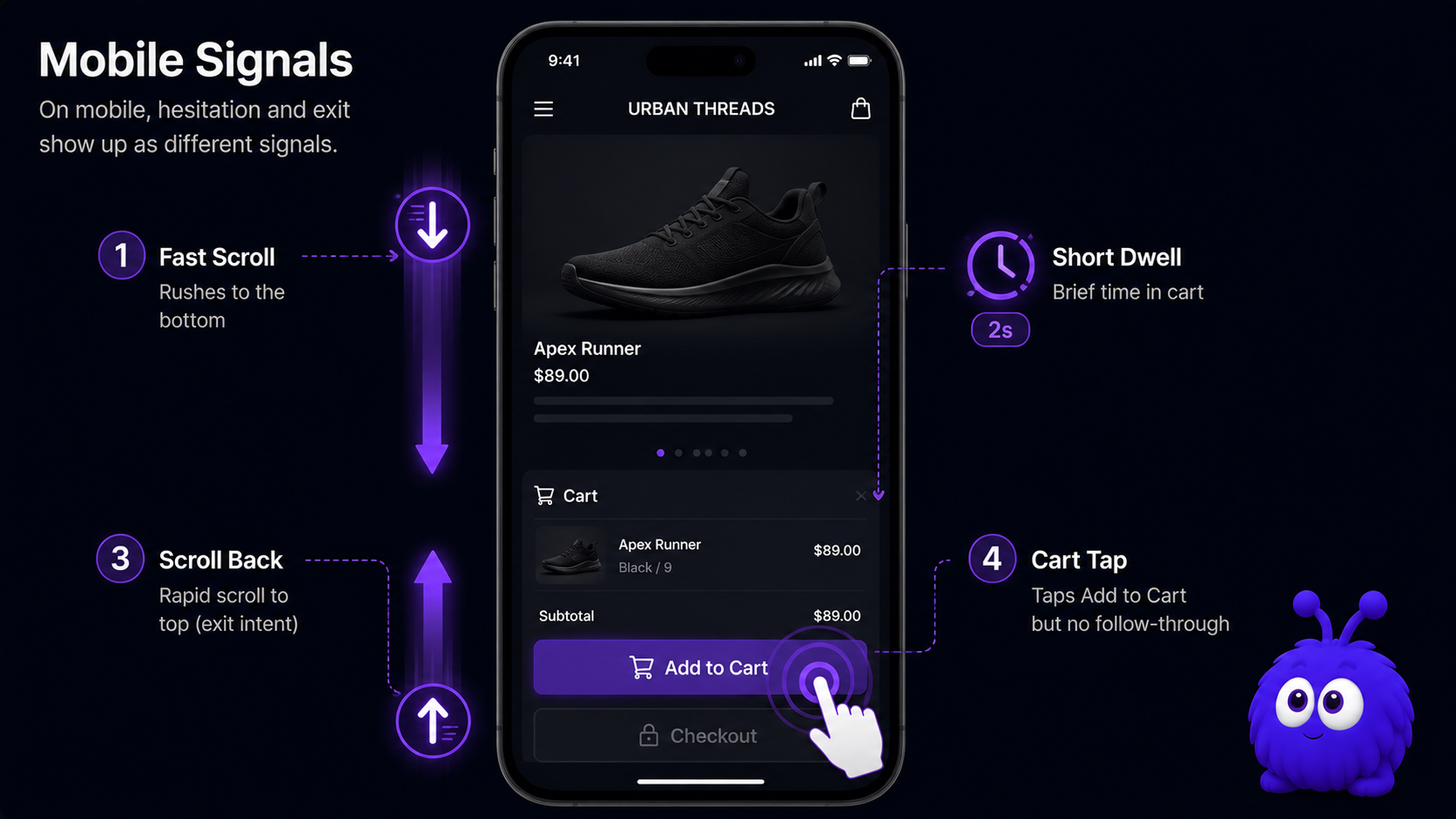
A "scrolled past 75%" signal that is strong on desktop is noise on mobile; the mobile threshold is 75% scroll plus a velocity slowdown in the bottom 25%.
Cart dwell duration. Mobile cart-page dwell is 60-70% of desktop dwell. A "30 seconds on cart" trigger calibrated for desktop fires too late on mobile; the mobile equivalent is 18-22 seconds.
Exit-intent vector. No cursor on mobile; cursor-out detection is impossible. The mobile equivalents: rapid scroll-to-top, tab visibility change, OS-level back gesture. Each is a different shape of exit intent.
Tap-without-commit. A mobile visitor who taps Add to Cart but does not proceed within 60 seconds is a different cohort than one who doesn't tap at all — closer to desktop hover-without-click but reading tap events.
Intervention shape also changes. A 480px chat panel that occupies one-third of a desktop viewport occupies the entire mobile viewport. The mobile-correct intervention is a bottom-anchored 56px-tall bar with a single CTA, expandable on tap. The Yokaify behavior-driven chat engagement implementation uses this pattern by default below 600px viewports.
What are the most effective mobile fixes?
The fixes fall into two groups. The first is interface work: cleaning up the payment and form steps where mobile visitors give up most often. The second is chat work: proactive help that reads mobile behavior and steps in at the right moment. They build on each other, so doing only one leaves money on the table. Add fast payment buttons and tidy the forms first, then layer mobile-aware chat on top.
When is the gap actually closeable?
The honest answer: the gap shrinks but does not fully close.
Two structural facts cap how far the gap can close. Cross-device attribution is incomplete — a visitor who clicks an Instagram ad on mobile, browses, leaves, and returns on desktop to buy is counted as a mobile non-converter and a desktop converter. The CVR delta overstates the actual mobile failure rate.
The realistic 2026 target: a 0.70-0.75x mobile/desktop CVR ratio with the UI fixes plus mobile-aware proactive chat. Below 0.55x indicates fixable leaks; above 0.75x indicates structural ceiling.
What this means for buyers and operators
Order the UI fixes by impact, not by cost. Apple Pay, Google Pay, and Shop Pay buttons are the biggest single mobile lift in 2026, and no other CRO work matters as much as adding them. Pick a chat product that reads mobile-specific signals; if the vendor's answer to "how do you detect exit-intent on mobile?" is generic, the mobile lift will be a fraction of the desktop number. And measure with mobile-only holdout groups — a store-wide A/B test averages mobile and desktop into a single number that hides flat mobile results behind strong desktop ones.
The shorthand: mobile is not a smaller desktop; it is a different interface with different signals, different interventions, and a different ceiling. Treating a phone like a shrunken laptop is how you end up with a checkout form that needs reading glasses and the patience of a saint. Treat it as its own surface and the gap shrinks meaningfully.
Further reading
Frequently asked questions
Mobile median 1.4-2.2%, desktop median 2.6-4.0% (Baymard Institute, 2026). Roughly 1.7x against mobile, slightly improved from 2.0x in 2022.
Last updated June 10, 2026.