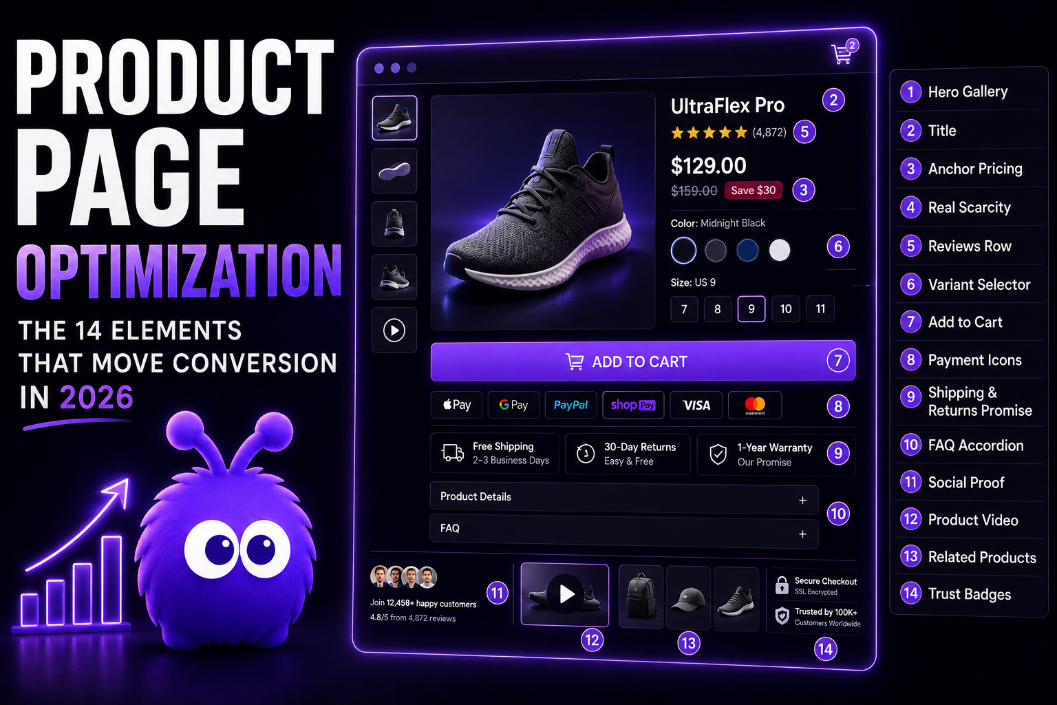
A 2018 product detail page got by with four things: an image, a title, a price, and an Add to Cart button. The modern version carries fourteen, and the gains stack — but only if you build them in the right order.
The 14 elements
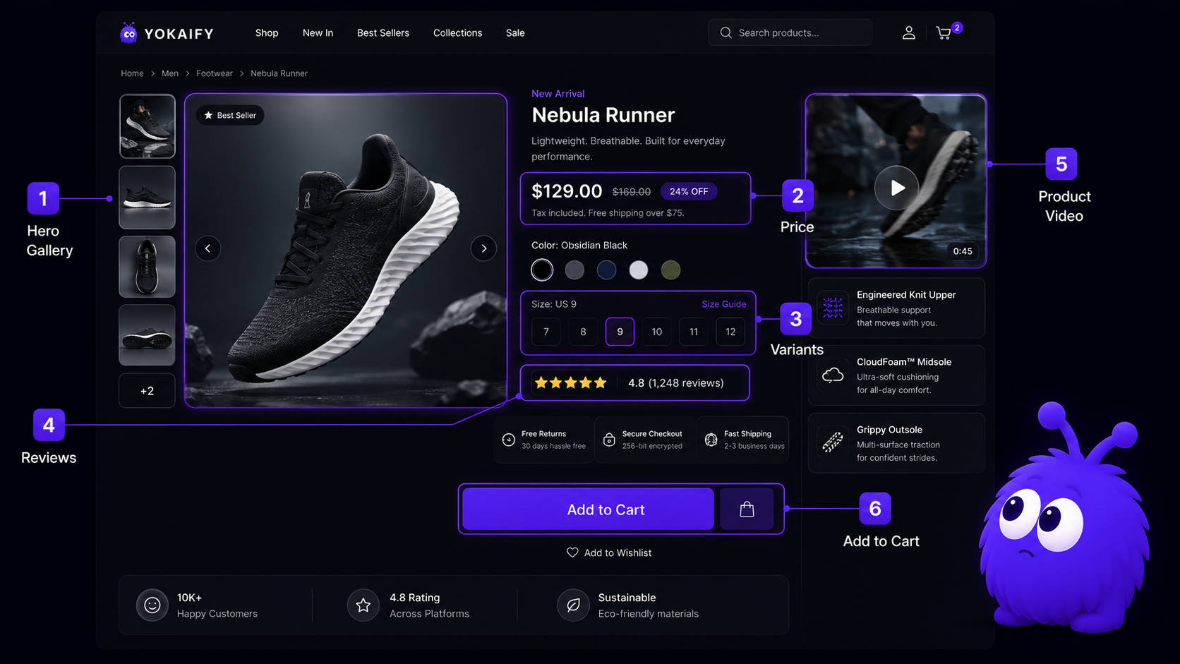
In rough priority order: hero gallery, variant selector, reviews row, prominent Add to Cart (the core four), then product video, anchor pricing, shipping & return promise, real scarcity, FAQ accordion, payment icons, social proof, trust badges, related products, title craft. The elements overlap and several substitute for one another — what follows is the implementation detail on the ones stores most often get wrong.
Why product video earns its place
The mechanism is friction removal in two places. Returns anxiety — a visitor who cannot tell whether a sweater drapes correctly is one who delays purchase; video resolves the question pre-purchase. Spec verification time — a 200-word description and five specs takes real effort to parse; a 25-second product video conveys the same information faster.
The video that works is not a polished commercial. What converts is a 20–40-second loop showing the product from three angles, ideally in use, with no voiceover. The goal is information, not aesthetics.
How the hero gallery works
A gallery of 4–7 images with zoom: lifestyle (one), product-on-white (two–three), detail shot (one–two), scale reference (one). Swipeable on mobile, click-to-zoom on desktop. The mix tracks where the visitor's unanswered questions live: what is it, what does it look like in use, how big is it, what's the texture up close.
Variant selectors: the disproportionately broken element
Four canonical mistakes show up constantly in checkout-usability research (Baymard's cart and checkout research catalogs the pattern):
- Stock state hidden until after Add to Cart. The visitor picks a variant, taps the button, and only then learns it's out of stock.
- Page reload on selection. Resets scroll position and adds latency at the exact moment of commitment.
- Color names that don't match the swatches. Three different beiges with three unrelated names.
- No inline size guide. A size picker that sends shoppers off to hunt for a chart is, in effect, politely showing them the door.
The FAQ accordion
Best-practice format: 4–8 questions, each phrased the way a visitor would ask ("Does this come in a wide width?" not "Width information"), each answer 1–3 sentences, the first question expanded by default. For chat-enabled stores, the FAQ and proactive chat compound: FAQ handles the common questions, chat handles the long tail.
Real scarcity vs fake scarcity
Real scarcity — a low-stock cue sourced from actual inventory — works because of loss aversion (Kahneman & Tversky's prospect theory): the prospect of missing the item outweighs the equivalent gain of a small discount. Three rules: tie the cue to actual inventory; refresh it when inventory changes (a permanent "only 3 left" erodes trust); pair it with a back-in-stock alert as the loss-framed extension.
Fake scarcity — fabricated stock counts, rotating urgency tickers — is both a trust liability and a regulatory one. The FTC's rule on consumer reviews and testimonials bans fabricated reviews with civil penalties per violation, and deceptive urgency patterns are named in dark-pattern enforcement guidance on both sides of the Atlantic. The social proof post covers the regulatory line in detail.
Where trust badges and social proof belong
Below the primary Add to Cart, above the FAQ. Both are reassurance, not persuasion. Specific beats vague: "Used by 12,000 stores including [named customers]" earns trust; "Trusted by Fortune 500 companies" with no names barely registers. Recent-purchase tickers ("John from Ohio just bought…") have crossed into banner blindness territory — visitors have seen the pattern on too many unrelated sites to read it as signal.
What this means for an operator
Build the page in priority order: gallery, variant selector, reviews row, and a prominent Add to Cart deliver the bulk of the lift; video is the strongest next addition; the remaining elements split the rest. Test the high-impact elements with A/B tests per category, and ship the low-impact ones (payment icons, FAQ, badges) without a test — their lift is small but reliable and they carry no downside. Then pair the page with in-session help that reads PDP-specific hesitation — dwell-on-price, a scroll back to reviews, hover on the size guide — via behavior-driven chat.
The 14 elements are not a checklist; they are a stack-ranked menu. Ship the top first, and do not ship the bottom without the top.
Further reading
- GuideThe CRO playbookThe broader CRO context the PDP work plugs into.
- GuideThe proactive chat playbookPDP-specific signal patterns and intervention shapes.
- BlogSocial proof in ecommerceThe deeper drill on reviews, UGC, and the regulatory line.
- BlogCheckout page optimizationThe next stage of the funnel after the PDP wins.
- ToolConversion rate benchmarkerSize the test against your baseline.
Last updated July 6, 2026.