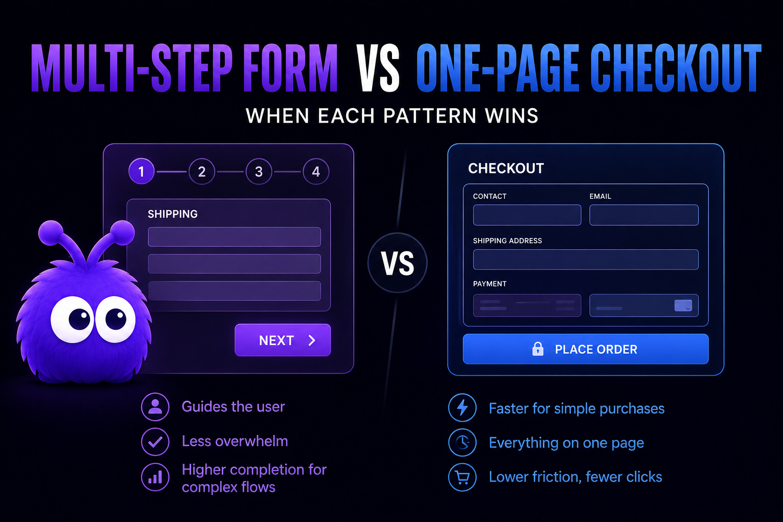
There is a side-by-side comparison of one-page and multi-step checkout if you want the checkout-specific version. This post takes the same trade-off and applies it to other forms: lead capture, B2B quote requests, registration, and surveys.
Which layout works best comes down to a few things: how many fields you have, how motivated your visitors are, the order value where it applies, and what the form is actually for.
When does multi-step beat one-page?
The cohorts where multi-step wins decisively:
B2B lead-capture forms with 8+ fields. A wholesale RFQ form with company, role, industry, MOQ, ship-to, payment-terms, SKU list, additional notes is 8+ fields. On one screen, the form looks intimidating; many B2B buyers bounce on first scroll.
High-AOV considered checkouts. Furniture, jewelry, B2B electronics - AOV $200+. Multi-step gives each consideration its own screen (shipping address with freight options visible, payment with terms visible, review-and-confirm with order summary).
Surveys longer than 4 questions. Survey completion rates drop sharply with question count on one screen. Multi-step (one question per screen, large progress indicator) holds completion at 60-70% even on 12-question surveys; one-page drops to 30-40% by question 8.
Forms with conditional logic. "If yes to question 3, show questions 4-6; if no, skip to 7" is cleaner across screens than collapsing/expanding within a single screen. Multi-step makes the conditional flow visible to the visitor.
The mechanism in all four: progressive disclosure reduces cognitive load on each screen. The visitor sees only what is relevant to the current step; their attention is allocated to the decisions in front of them, not to the broader form ahead.
When does one-page beat multi-step?
The opposite cohorts:
Sub-$50 DTC checkout. A $30 t-shirt purchase does not need progressive disclosure. The visitor has decided; the checkout's job is to not get in the way. Multi-step on these flows adds clicks without adding decision support; nobody wants a three-act structure to buy a t-shirt.
Returning-buyer flows. Visitors who have purchased before know what to expect. The form's purpose is execution, not decision support. One-page is faster for the cohort that has the muscle memory.
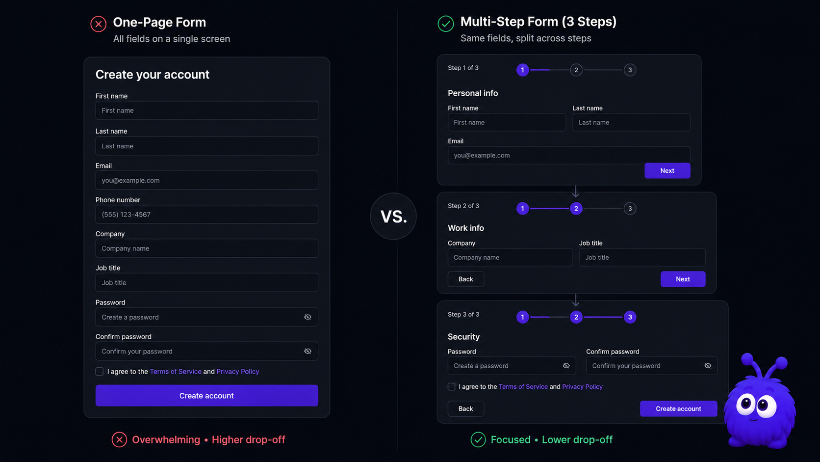
Forms with 4 or fewer fields. Below 5 fields, the form is short enough that the visitor can scan it in one glance. Splitting 4 fields across 2 steps adds navigation friction without simplifying the cognitive load.
Single-SKU subscription signups. Substack, newsletter, premium-subscription. The visitor is committing to one thing; the form is plan-selection + payment. Two fields effectively; one-page is decisively faster.
Mobile-keyboard-aware short forms. A short form with sequential field auto-focus on mobile is faster than navigating between mobile screens. The keyboard advances the focus; the visitor types; submit fires. Multi-step on mobile requires extra tap-to-advance interactions that the one-page pattern avoids.
What's the field-count threshold where the patterns flip?
Roughly 5 fields, with significant variation by traffic intent and AOV.
The crossover band (5-7 fields) is wide enough that other factors dominate. AOV, traffic intent, mobile vs desktop, B2B vs B2C - any of these can flip the result inside this band.
The multi-step advantage compounds with field count. The longer the form, the more multi-step wins.
The one-page advantage flattens past 4 fields. The one-page advantage is for genuinely short forms; "one-page checkout" with 12 fields is one-page architecture but not one-page UX.
Is the rule different for B2B vs B2C?
Yes, in two specific ways.
B2B forms tend longer, so they tend to want multi-step. The wholesale quote form has 8-11 fields typically. Even when fields could be cut, many B2B operators (correctly) want the qualification data captured upfront to route the lead properly. Multi-step is the natural fit.
B2C forms tend shorter, but mobile dominates. B2C checkout has 4-8 fields typically and 73% of traffic is mobile (Statista 2026). Mobile-optimised one-page can outperform multi-step here even when the field count is at the upper edge of one-page's natural range.
B2B traffic intent is higher. A buyer filling a wholesale quote form has decided to ask; they will tolerate longer forms because the alternative (calling sales) is more friction. B2C visitors have many alternatives; the form needs to be obviously easy to complete.
B2B forms benefit from explicit qualification questions. Multi-step lets the form ask clarifying questions (use case, timeline, budget) without overwhelming the visitor on one screen. Lower-friction qualification = better-quality leads.
The pattern: B2B usually wants multi-step; B2C usually wants one-page. Below 5 fields, both patterns work; above 8 fields, multi-step is the safer choice regardless of B2B/B2C.
Does multi-step work on mobile?
Yes when designed for mobile; the design discipline matters.

The patterns that work on mobile multi-step:
- Sticky-footer step indicator + navigation. Always visible; the "Continue" button is always tappable; the progress (2 of 4) is always readable. Non-sticky implementations push the progress indicator off-screen during keyboard input; visitors lose context.
- Large touch targets. 44 CSS pixel minimum (WCAG 2.2 AA); 48 CSS pixel ideal. Small step-navigation buttons miss-tap on mobile keyboards.
- Field-type matching.
<input type="tel">for phones,type="email">for email,type="number" inputmode="numeric">for numeric. The mobile keyboard adapts; the form feels native. - No fixed-position elements that conflict with the soft keyboard. A footer-sticky CTA that disappears behind the keyboard wastes the visitor's tap.
- Per-step validation, not on-blur. Validate when the visitor advances to the next step. Per-field validation on blur produces noisy error states on mobile; per-step is calmer.
Done poorly, mobile multi-step completes lower than mobile one-page because the navigation friction outweighs the cognitive-load benefit.
The form layout optimizer tool covers the optimisation parameters; the Tailwind ecommerce components library covers the trust-row and progress-indicator patterns.
What's the single biggest mistake in multi-step forms?
Hiding the order summary or the progress indicator.
Visitors need to see two things at all times: what they are committing to (order summary or form purpose) and how far they are through the form.
The fixes are mechanical:
- Sticky summary on every step. A collapsed summary at the top (mobile) or a side panel (desktop) shows what the visitor is filling the form for. Cart contents on a checkout; lead-purpose statement on a B2B form; survey topic on a survey.
- Progress indicator (1 of 4, 2 of 4, etc.). Non-negotiable for any form longer than 2 steps. Bar with current step highlighted is sufficient; numeric "2 of 4" is also fine.
- Back navigation that does not reset the step. Visitors expect to be able to back up and edit. Hard-resetting the step on back navigation produces frustration; persistent state across navigation is the right pattern.
The flip side: do not over-design the indicator. A "wizard" pattern with check-marks for completed steps and elaborate transitions adds visual noise without functional value. Simple bar + step number works.
Further reading
- ToolMulti-step form optimizerVisualise the field split for your form.
- ToolWholesale quote form configuratorB2B form architecture in practice.
- ToolTailwind ecommerce componentsTrust row and progress indicator patterns.
- GuideWebsite lead captureThe broader lead-capture playbook.
- GuideB2B ecommerce in 2026Where multi-step forms sit in B2B funnels.
- BlogCheckout page optimizationThe B2C checkout side of this comparison.
- vs.One-page vs multi-step checkoutThe architectural comparison this post covers form-side.
Frequently asked questions
Roughly 5 fields. Below: one-page wins. 5-7 fields: tied, other factors dominate. 8+ fields: multi-step wins.
Last updated June 10, 2026.