"What's a good conversion rate?" is the most common benchmarking question in ecommerce, and most answers quietly copy a single number without saying where it came from. The truth is that the major public benchmarks disagree — because they measure different store populations — and knowing which benchmark matches your store matters more than the headline number.
The average, by source
| Source | Average CVR | Population measured |
|---|---|---|
| Dynamic Yield global benchmark | 2.66% | Dynamic Yield clients (skews enterprise) |
| IRP Commerce market data | ~1.7–1.9% | Cross-industry tracked sectors (updates monthly) |
| Littledata Shopify benchmark | 1.4% | 2,800+ Shopify stores |
| Statista global retail (cited by Shopify) | 1.6% | Global retail |
How to read that table:
- If you run a Shopify store, Littledata is your benchmark: average 1.4%, top 20% above 3.2%, top 10% above 4.7%.
- If you're an established multi-channel retailer, Dynamic Yield's 2.66% panel is closer to your peer group.
- A broad working range: treat 2–3% as normal, 3%+ as strong, 4%+ as excellent. Anyone quoting a single universal "average" to one decimal place is overselling precision.
Your industry moves the number as much as your execution: in every public panel, food & beverage and beauty convert near the top of the range while furniture, electronics, and luxury convert near the bottom — higher prices and longer consideration cycles, not worse websites.
Mobile vs desktop: what the data actually shows
The honest picture is messier than the usual "mobile converts worse" line:
- Traffic is mobile. Mobile accounts for roughly 75% of ecommerce visits in Dynamic Yield's device-usage benchmark, with desktop around 23%.
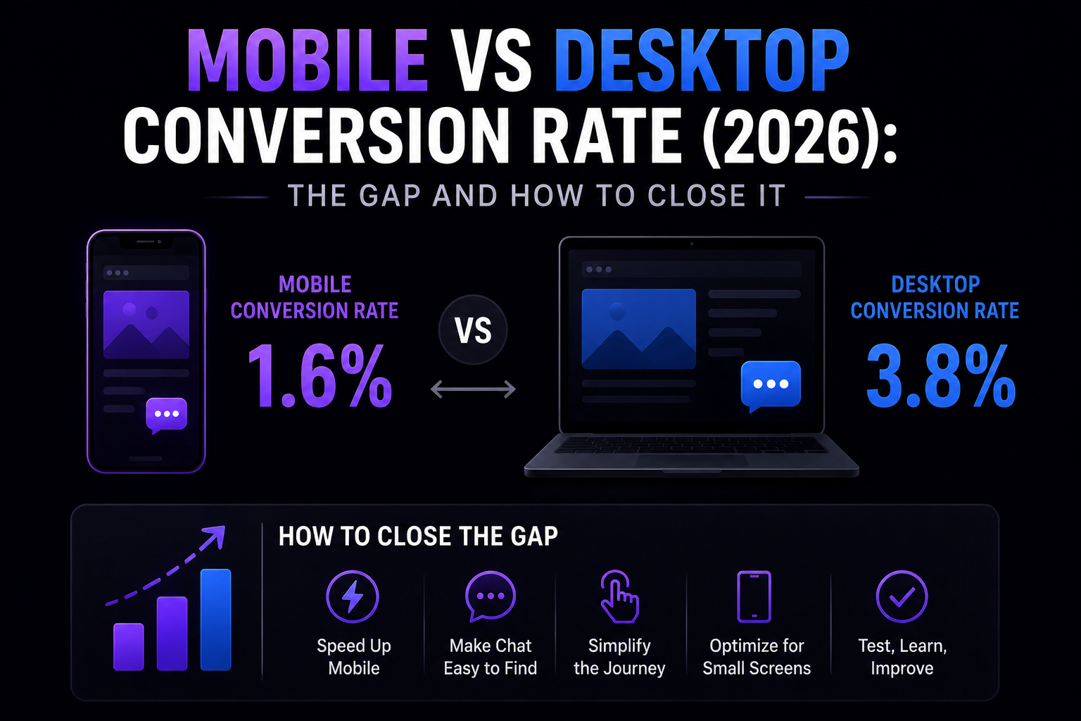
- Shopify stores: desktop converts ahead. Littledata's device split puts Shopify mobile at ~1.2% vs desktop at ~1.9% (Littledata).
- Enterprise panels: the gap has closed. Dynamic Yield's panel currently shows mobile slightly ahead of desktop on raw CVR — evidence that well-resourced stores with mature express-checkout coverage have largely engineered the gap away.
- Abandonment is still worse on mobile everywhere. Dynamic Yield's cart abandonment benchmark puts mobile at ~80% vs desktop at ~66%.
- Desktop baskets are bigger. Metorik's WooCommerce dataset finds 72% of orders are mobile, but desktop shoppers spend ~2.3x more (Metorik).
The takeaway: the mobile gap is not a law of nature — it is accumulated friction, and the stores that removed the friction no longer have the gap.
Why mobile converts lower (when it does)
Three structural causes — none of them about visitor intent:
Form friction. Typing on a phone is slower and more error-prone; the virtual keyboard hides the next field; autofill matches inconsistently; dropdowns become full-screen modals that break the visitor's place.
Payment friction. Desktop browsers reliably store card details; mobile autofill is weaker. This is why express wallets (Apple Pay, Google Pay, Shop Pay) are the single biggest mobile lever — they replace the entire form with one tap. See checkout page optimization for the full lever list.
Viewport friction. A desktop visitor sees price, Add to Cart, reviews, and trust badges in one glance. A mobile visitor sees them one screen at a time, and loses comparison context on category pages.
Closing the gap: what works, in order
- Express payment buttons. Apple Pay, Google Pay, Shop Pay. The largest single mobile lift available; nothing else on this list matters as much.
- Cut form fields. Baymard's checkout research shows most checkouts can remove 20–60% of their default form fields without losing required information.
- Mobile page speed. Slow taps compound every other friction. Test your store with our speed analyzer.
- Mobile-aware in-session help. Mobile hesitation looks different from desktop hesitation: there is no cursor, so exit shows up as rapid scroll-to-top, tab switches, or the back gesture, and cart dwell runs shorter. A behavior-driven chat engine that reads mobile-specific signals — and intervenes with a compact bottom bar rather than a viewport-filling panel — catches the shoppers the form fixes miss.
Measuring your own gap honestly
Two cautions before you panic about your mobile number:
Cross-device journeys undercount mobile. A shopper who finds you on Instagram on their phone, browses, and buys on a laptop that evening is logged as a mobile non-converter and a desktop converter. Part of every mobile "gap" is attribution, not failure.
Test devices separately. A store-wide A/B test averages mobile and desktop into one number that can hide a flat mobile result behind a strong desktop one. Segment every experiment by device, and benchmark each against its own baseline — not against the blended average.
The shorthand: mobile is not a smaller desktop; it is a different interface with different friction and different signals. Treat it as its own surface, and the benchmarks above show the gap can close.
Further reading
- ToolConversion rate benchmarkerCompare your CVR against your industry.
- BlogCart abandonment statisticsThe verified abandonment numbers, with sources.
- BlogCheckout page optimizationThe checkout-stage levers, mobile-first.
- BlogShopify conversion rate benchmarksThe platform-specific numbers for Shopify stores.
- GuideBehavior-driven proactive engagementThe mobile-aware trigger stack.
Benchmarks re-verified against their sources on July 6, 2026.