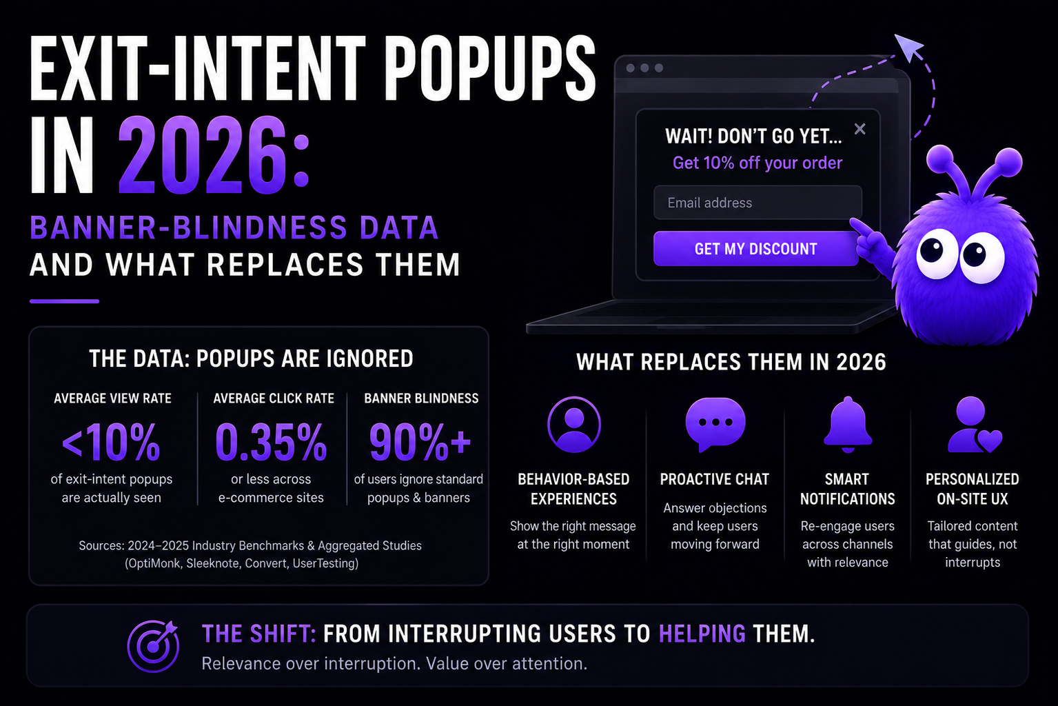
The exit-intent popup was the default abandonment-recovery surface from roughly 2014 to 2018, and it worked largely because it was new. By 2026 the format is everywhere, and the same pattern that once got read now mostly gets dismissed on sight — the classic banner blindness mechanism, where a saturated visual format stops registering at all (Nielsen Norman Group has documented this effect for decades).
This post covers how exit-intent works, the best practices if you run one, where the format still earns its place, and the behavior-driven alternatives that have largely replaced it.
How exit-intent detection works
Desktop: the classic trigger is a mouseleave event fired when the cursor moves toward the top of the viewport — toward the back button, the URL bar, or the tab strip. It is a strong, cheap signal.
Mobile: there is no cursor, so implementations rely on composite proxies:
- Rapid upward scroll velocity (scrolling back to the top to leave)
- The hardware/OS back gesture
visibilitychangeto hidden (tab switch, app switch)pagehideon navigation
These proxies are noisier than desktop mouseleave. A legitimate scroll-to-top (to re-check the nav, to re-read the title) fires the same signal as an exit, so mobile popups misfire more often — one reason the format underperforms on the device that now carries most ecommerce traffic.
Why the format decayed
Three structural reasons:
Format saturation. Visitors have seen thousands of "wait! before you go…" modals. The format itself now triggers a dismiss reflex before the content is read — the same mechanism behind banner blindness.
The shift to mobile. Ecommerce traffic is now majority-mobile, and mobile is exactly where exit detection is weakest and where a full-screen modal is most intrusive.
Discount fatigue. The 2014 popup offering 10% off felt like a one-time opportunity. Today's visitor expects discounts everywhere — and some shoppers have learned to induce the popup to harvest the discount, which quietly trains adversarial cart-abandonment behavior.
Exit-intent popup best practices
If you run one — and there are legitimate reasons to, covered below — these practices separate the useful from the annoying:
- Fire once per visitor, not once per page. Cross-session frequency capping is the single biggest respect signal. A popup that reappears on every page teaches visitors to hate it.
- Make the offer contextual. "Your cart still has the items you picked" beats a generic 10%-off. If you must discount, tie it to a real deadline.
- Never block the checkout path. Exit popups on the checkout itself interrupt people who were completing the purchase.
- Do the accessibility work. Keyboard-dismissable, focus-trapped while open, announced to screen readers. Most popup implementations skip all three and ship a WCAG failure.
- Respect the mobile context. If your mobile trigger is noisy (and it is), either don't ship the popup on mobile or use a small bottom bar instead of a full-screen modal.
- Watch the page-weight cost. Popup libraries add JavaScript and CSS that load on every page to fire on a tiny fraction of visits. Measure the Core Web Vitals impact before and after.
- Test against a real holdout. Measure conversion with the popup off, not just popup views vs conversions — attribution without a holdout flatters the popup.
When exit-intent popups still work
Three cohorts where the format still produces meaningful lift:
First-time visitors to small or specialty stores. People who haven't been worn down by the format in your niche still read it — novelty is the whole mechanism, and it still exists in pockets.
New product launches with genuine deadline urgency. "Last day for the launch discount" with a real deadline beats the rolling-discount popup, because visitors recognise real urgency.
Travel and comparison-heavy categories. Visitors comparing options often abandon mid-comparison, and an exit popup framed as "save this search" captures that intent honestly.
For most ecommerce in most categories, the popup is not worth the implementation cost. For these specific cohorts, it can still earn its place.
What to use instead
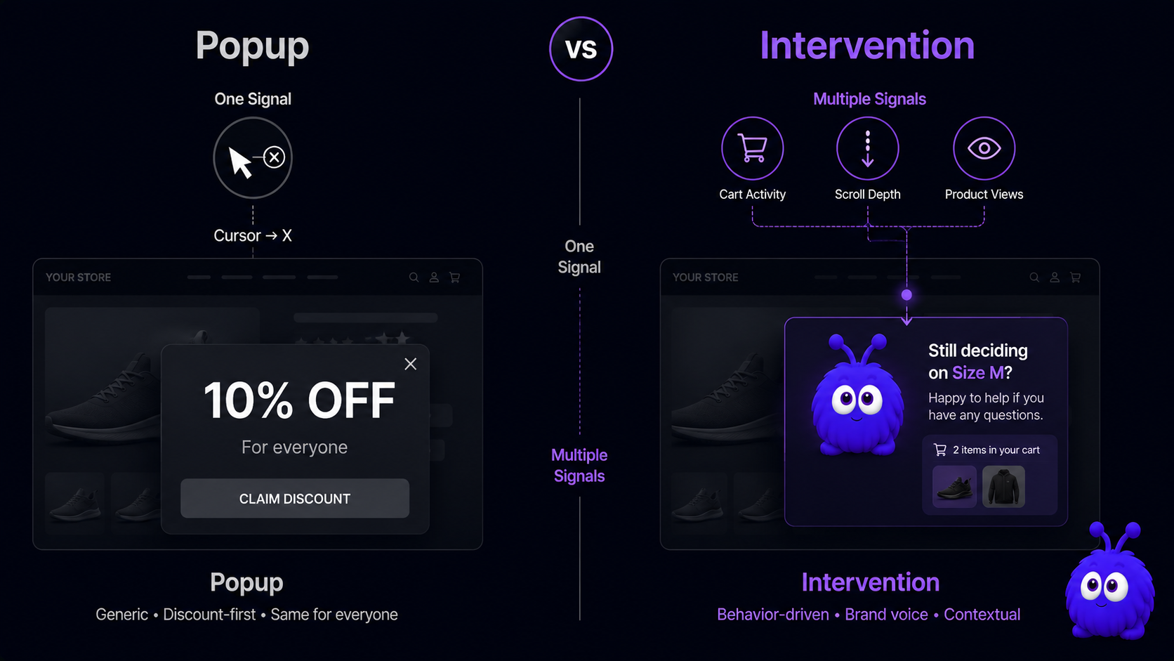
The replacement is behavior-driven, multi-signal intervention:
- A multi-signal trigger. Not just "cursor moved toward the top," but that combined with cart state, dwell time, and visit context — a much more selective cohort than exit-intent alone.
- A surface visitors haven't learned to ignore. A brand-matched character or a native chat surface doesn't pattern-match to the saturated popup format.
- A contextual message. Your cart has X; you're $12 from free shipping; the size you viewed is back in stock — rather than a generic discount fired at the door.
- Cooldown and throttling. Cross-session limits avoid the always-there pattern that wore the popup out.
The combined system behaves differently from a popup not because it is more aggressive but because it is more selective and more contextual. That is the design premise behind onsite conversion agents.
How to migrate off an exit popup
Add the replacement intervention in parallel. The two don't conflict; they fire on different signals.
Run a 30-day holdout comparison. Three cohorts: both surfaces on, intervention-only (popup off), and neither. Measure conversion per cohort, not clicks.
Decommission the underperformer. Some stores keep the popup for one specific cohort (e.g. a launch calendar). Most find it cleaner to remove entirely — and pocket the page-weight and accessibility wins as a bonus.
Further reading
- ToolCart abandonment calculatorModel the recovery upside.
- GlossaryExit-intentThe behavior signal underlying the popup pattern.
- GlossaryBanner blindnessThe mechanism behind the popup decay.
- BlogCart abandonment statisticsThe verified numbers on why carts are lost.
- GuideThe cart-recovery playbookThe full recovery framework.
Last updated July 6, 2026.